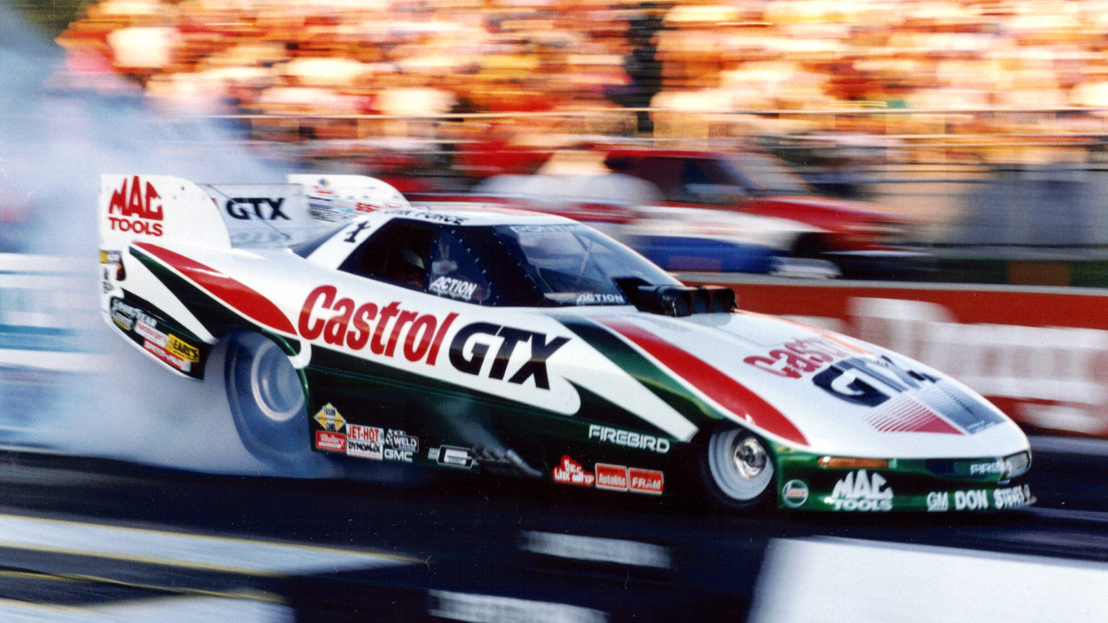
# These Are The Best Liveries In Racing
Racing liveries have shaped how fans remember cars for generations. The best designs transcend mere decoration, becoming iconic symbols of speed, sponsorship, and era-defining competition.
Jalopnik's analysis highlights a curious pattern: many legendary liveries belong to cars that competed across multiple decades. These classic designs carry historical weight. A livery that looked modern in 1970 often retains aesthetic power today because the proportions, color theory, and graphic principles were fundamentally sound.
Consider the evolution of racing aesthetics. Sponsorship determined much of what appeared on cars. Tobacco companies, fuel brands, and equipment manufacturers created bold, contrasting patterns that broadcast identity from the grandstands. The Gulf Racing blue and orange became inseparable from Le Mans history. Martini Racing's red and white stripes defined Porsche's competitive era.
What separated the best liveries from the forgettable ones came down to simplicity and contrast. Drivers and mechanics needed to identify their cars instantly in pit lanes and on track. Fans needed to track their favorite teams across a crowded grid. A clean, high-contrast design accomplished both.
Many championship-winning cars carried timeless liveries because successful teams refined visual language over years of competition. They didn't chase trends. The Senna-era McLaren Honda red and white. The Ferrari Rosso Corsa that dates back to Italy's national racing color. Aston Martin's British Racing Green. These weren't fashionable distractions. They were tools that aged gracefully.
Modern racing has struggled to match this legacy. Contemporary liveries often feature fragmented sponsor logos that clutter the design. The rise of digital visibility has paradoxically made cars harder to visually parse at speed.
The best liveries prove that simplicity endures. A two or three color scheme